New to hand tracking itself? See the 60-second visual explainer before this one, it covers how the camera reads your fingers, this article covers how to design and brief around it.
Why phone interaction patterns fail on glasses
Almost every smart glasses brief that lands on a creative director's desk starts life as a phone screen. Someone sketches a menu, a set of buttons, a swipeable card stack, then asks the build team to "make it work on glasses." The layout survives the port. The interaction does not.
A touchscreen gives you three things that glasses simply do not have: a fixed rectangle with defined edges, a thumb that can hit a 44-pixel target with precision, and a user whose full attention is already on the screen. Take any of those away and a button stops being a button. It becomes an object floating in a room the wearer is also trying to look at, with no reliable way to select it and no edge to anchor it against.
This is the first thing to brief correctly, and the thing agencies get wrong most often: the input mode has to be chosen before the visual layout, not after. If the deck shows a nav bar, it was designed for a phone, and someone downstream will have to redesign the interaction from scratch once it reaches the glasses. For the broader shift in how the visual brief changes, see designing for smart glasses. This article is about the narrower, more practical problem underneath it: what does the wearer actually do with their hands, voice, or eyes instead of tapping?
What actually replaces tap, swipe, and type
Four input modes cover almost everything a touchless interaction needs to do. Most good briefs use two of them together, because each has a different failure mode and none of them is reliable on its own.
Voice: for anything you would have typed or searched
Voice is the closest thing glasses have to a keyboard. It is the right choice for search, for naming or labelling something, for triggering an action from a distance, and for any command that does not need visual confirmation to feel complete. It fails in loud environments, in front of an audience who can hear every command spoken aloud, and in any brief where the user does not want to be seen talking to their glasses in public. Design a voice interaction with a visible or audible confirmation for every command, never a silent action. For a deeper look at voice as the primary channel on screenless platforms, see voice AI on smart glasses.
Hand pinch and pointing: for anything you would have tapped
On Snap Spectacles, the Spectacles Interaction Kit gives three hand-tracking modes: an indirect ray the user points at a distant target, a direct pinch for objects within arm's reach, and a direct poke for touching something close up. The right mode depends entirely on where the content lives in space, not on which is easiest to build. A menu placed at a distance needs ray-pointing. A tabletop-scale object within reach needs pinch or poke. Mixing the two without a reason confuses the wearer about which gesture applies where.
The failure mode here is fatigue, not tracking accuracy. Holding an arm outstretched to point or pinch is tiring within two to three minutes, a phenomenon usually called gorilla arm. Keep primary actions within a natural, relaxed reach and never require a sustained raised-arm gesture to complete a core task.
Gaze and dwell: for lightweight selection, not primary navigation
Looking at something and holding your attention on it for a fraction of a second (dwell) can select or highlight an object without any hand movement at all. It is well suited to glanceable confirmation, low-stakes selection, or as a secondary channel alongside voice or hand tracking. It is a poor primary input for anything requiring precision or confirmation, because eye movement is involuntary and a wearer can trigger a dwell selection by simply looking around the room.
Spatial anchoring: removing the need for a menu at all
The most elegant touchless pattern is often no interaction at all: content anchored to a fixed position in the real world that the wearer walks toward, looks at, or simply encounters, rather than a menu they have to operate. A spatial anchor turns navigation into movement, which is an input everyone already knows how to do. This is the pattern behind most Custom Location AR and any brief where the physical space itself can carry the structure a UI would otherwise need to provide.
What noodle got wrong first, and how it got fixed
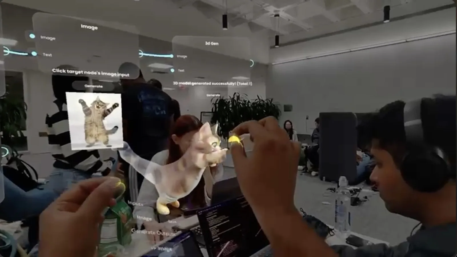
noodle, the spatial AI workbench we built for Snap Spectacles that won the Snap category at MIT Reality Hack 2026, is a useful case study precisely because the first version got the interaction wrong before it got it right. Full build story at building noodle at MIT Reality Hack 2026.
The first prototype ported a node-based workflow UI, the kind you would see in a desktop creative tool, straight into spatial panels with pinch-to-connect gestures between nodes. It technically worked within a day. It was also hard to use in a way that was difficult to diagnose from inside the build, because the problem was not visual, it was interaction sequencing: users could not tell which node they were holding, and their own hands would occlude the connections they were trying to make.
The fix was not a better-looking UI. It was a different interaction model. The team flattened the free-form node graph into a sequence of single, clear pinch-and-voice steps, replaced most visual onboarding with short directional audio cues ("raise your hand to create"), and anchored the controls to a fixed position relative to the user's body while letting the generated output occupy wherever they pointed. A first-time Spectacles user, with no instructions, could complete the workflow using only their hands and voice. Try the live build at ar.rbkavin.studio or read the noodle case study.
Ice Fishing: when the simplest input wins
Not every touchless problem needs voice, hand tracking, and gaze combined. Ice Fishing, a hyper-casual AR game we self-initiated on Snap Spectacles, uses one input: the phone the wearer already has in their pocket as a 6DOF controller, cast and reel mapped directly onto phone tilt and motion. Spectacles supports the phone as a native pointer, and most teams treat that capability only as a laser-pointer replacement. Ice Fishing treated it as the entire control scheme, because a physical object the wearer already knows how to hold beats any gesture they have to learn from scratch.
The lesson generalises past games. Before reaching for hand tracking or voice, check whether the platform already gives the wearer something familiar to hold or point, a phone, a controller, their own hand at rest. The simplest input that a wearer does not have to be taught is almost always the right one.
Common mistakes agencies make briefing this
How to brief a touchless interaction design correctly
A workable brief for this kind of work answers four questions before any visual design starts: which platform (because Spectacles, Meta Ray-Ban Display, and Meta Ray-Ban Gen 2 each support a different set of inputs), what is the primary input mode and why, what is the fallback if that input fails mid-session, and how long is a single session expected to run. Spectacles has roughly a 45-minute battery ceiling for continuous use, which makes 10 to 15 minute sessions the practical target for most brand experiences, not a compromise.
Get those four answers settled first. Everything else, the visual layout, the audio design, the onboarding sequence, follows from them far more easily than it does from a screen mockup that has to be unlearned later.
The principle that held across noodle and Ice Fishing
The best touchless interaction is the one the wearer does not have to learn. Voice, pinch, gaze, and spatial anchoring are all valid tools, but the winning choice in practice is usually whichever one maps to something the wearer already knows how to do with their body or their voice.
This is a design discipline, not a technical one. The build follows the interaction decision, not the other way round.
Frequently asked questions
What replaces tap, swipe, and type on smart glasses?
Four input modes cover most of it: voice commands for anything you would have typed or searched, hand pinches and pointing for anything you would have tapped, gaze and dwell for lightweight selection, and fixed spatial anchors that remove the need for a menu at all. Most well-designed glasses experiences combine two of these rather than relying on one, because each has different strengths and failure modes.
Why do phone UI patterns fail when ported to smart glasses?
Phone UI assumes a bounded rectangle, a thumb, and full attention on the screen. Glasses have none of those. A menu that made sense as a swipeable carousel becomes an object floating in someone's field of view that they cannot reliably tap, hovering over a room they are also trying to look at. The layout survives the port. The interaction model does not.
Is voice or hand tracking more reliable for smart glasses interaction?
Neither is reliable enough to be the only input on its own. Voice fails in loud environments and in front of an audience who can hear every command. Hand tracking fails when the user's hands are full, in low light, or after two to three minutes of arms-up interaction (gorilla arm). Design for one primary mode with a fallback, not a single point of failure.
How much does designing a touchless smart glasses interaction cost?
Interaction design for a Snap Spectacles brief typically runs alongside the build rather than as a separate line item, and scope depends heavily on how many input modes the experience needs to support. A single-mode, single-session experience (voice only, or hand-pinch only) is the fastest to design and test. Every additional input mode or fallback path adds design and QA time, since each has to be tested on-device, not just in a simulator.
Do Meta Ray-Ban smart glasses need the same interaction design as Snap Spectacles?
No. Meta Ray-Ban Gen 2 has no display and no hand tracking, so the entire interaction is voice in, audio out, which is a conversational design problem. Snap Spectacles has a full AR display with hand and voice tracking, so it supports gaze, pinch, and spatial anchoring as well as voice. Briefing the two platforms as if they take the same interaction spec is the single most common mistake agencies make.
What is the biggest mistake agencies make briefing a touchless AR interaction?
Writing the brief around a screen mockup. If the deck shows buttons, a nav bar, or a swipeable card stack, it was designed for a phone and someone will have to redesign the interaction from scratch once it reaches the glasses team. The fix is to brief the input mode first (voice, hand, gaze, or a fixed anchor) and let the visual layout follow from that, not the other way round.
Insights newsletter
Smart glasses, AR campaigns, spatial computing.
Straight to your inbox. No noise.
Subscribe