The fundamental shift
When you design for a phone, you are designing for a rectangle. You know its dimensions, its resolution, its pixel density. You know the user is holding it at roughly arm's length and looking directly at it. Layout, typography, interaction, and motion are all calibrated for that rectangle.
Smart glasses break every one of those assumptions. The canvas is no longer a screen you hold. It is the space around the person wearing the glasses. Content can sit two metres in front of them, anchored to a wall, floating at eye level, or attached to an object they are looking at. There are no edges. There is no home screen. The user is not looking at a device: they are standing inside the experience.
The practical consequence: you are no longer composing layouts. You are composing presence. Where does information live in space? How does it move when the user turns their head? What happens when they walk closer or further away? These are architectural questions as much as they are design questions, and they require a different kind of thinking from the start.
FOV is a design constraint, not a limitation

The 5th generation Snap Spectacles have a 46-degree diagonal stereo field of view. That is roughly what you see when looking at a monitor at arm's length. At 37 pixels per degree, the display is dense enough to read clearly. But 46 degrees is still a bounded canvas in an unbounded world, and understanding what that means in practice is the first job of a spatial designer.
In that 46 degrees, the comfortable reading zone is the centre 20-25 degrees. Content placed at the outer edges of the FOV sits in peripheral vision. Users can see it, but it is harder to resolve and tends to feel like clutter rather than information. The best spatial interfaces treat the centre as the primary content zone and use the periphery only for ambient cues: a dot indicating there is something to the right, a subtle pulse indicating an active process.
Restraint produces better experiences than filling the space
Every designer who moves from phone to glasses goes through the same arc. First pass: pack as much as possible into the FOV. It all fits. Why not use it? The user puts the glasses on, looks around for two seconds, and feels overwhelmed. The problem is not the quantity of information. The problem is that spatial information competes with the real world. On a phone, you are looking at a screen. Nothing else is visible. On glasses, a UI element has to coexist with a room full of objects, light changes, movement, and other people. Density that reads clearly in isolation reads as noise in context.
The answer is restraint. Show one thing at a time. Give each element enough breathing room that it is readable without straining. Remove anything that does not serve a direct action. This is not a creative limitation: it is what makes spatial UI feel considered rather than ported.
Hands replace touch
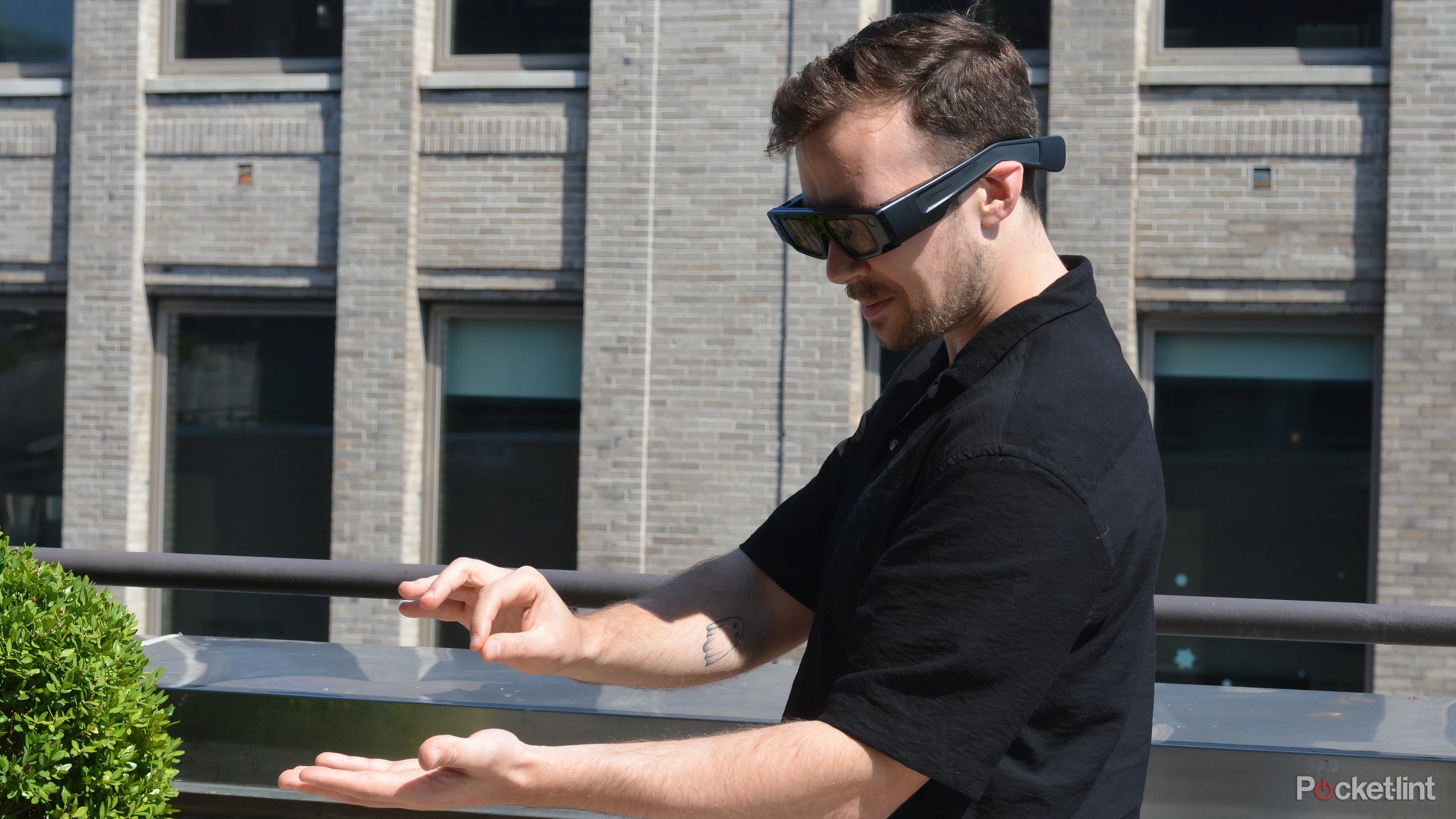
Snap Spectacles' Interaction Kit (SIK) gives you three interaction modes: indirect ray-pointing (the user aims a virtual ray from their hand toward a target), direct pinch (the user reaches out and pinches to interact with something in their immediate reach), and direct poke (the user physically touches a target with their fingertip). Two-hand tracking runs at full fidelity alongside 6DoF world tracking, so the system always knows where the hands are in space.
These three modes serve different use cases. Ray-pointing is useful for menus and UI panels that sit at a distance from the user. Direct pinch and poke are for objects placed within arm's reach, which is why they feel natural in product interaction and in experiences that use tabletop-scale content. The choice of mode should be driven by where the content lives in space, not by which is technically easiest to implement.
Instant visual feedback is not optional
Hand tracking has come a long way, but there is always some gap between intent and registration. When a user reaches for something and it doesn't immediately respond, they do not think "there is a 13ms latency in the system." They think the experience is broken. The fix is to show feedback before the action is fully committed: a hover state when the hand approaches a target, a visual pulse when a gesture is recognised, an immediate animation when something is selected. The feedback loop has to be faster than the user's expectation, which means it has to be faster than they think it needs to be.
Reach and fatigue are real constraints
Gorilla arm is a real phenomenon: holding your arms outstretched for extended interaction is tiring, usually within two to three minutes. Good spatial interaction design keeps primary actions within a natural reach arc, avoids requiring sustained raised-arm gestures, and respects that 45 minutes of continuous Spectacles use is the battery ceiling. Designing for ten to fifteen minute sessions is not a compromise: it produces better-paced experiences that users actually finish.
Audio is underused
Every spatial design conversation starts with visuals and ends there. Audio gets added at the end, if at all. This is backwards. On smart glasses, audio is frequently the clearest output channel available, and on some platforms it is the only one.
Meta Ray-Ban Gen 2 has no display whatsoever. The interaction is voice in, audio out. Designing for it means designing a conversation, not a layout. The spatial audio from the glasses' speakers is directional, which means you can place sound in space: a notification chime that comes from the left to indicate there is something to the left, a confirmation tone that feels like it comes from directly in front. This is spatial audio as navigation, and it works better than most visual UI in ambient-use contexts. For what brands can actually build on voice-first glasses, see voice-first AI on smart glasses.
On Spectacles, audio is an enhancement, but it is a powerful one. When we built noodle, we experimented with visual-only onboarding prompts: small labels, pointer arrows, UI panels explaining the workflow. Users read them, mostly ignored them, and got confused about what to do next. When we replaced those prompts with short spatial audio cues, task completion improved substantially. "Raise your hand to create" landed better as a voice prompt than as text floating in the FOV. The lesson: audio confirmation and guidance often serves users better than visual UI, even when a display is available.
Design for sessions, not screens
On a phone, there is no meaningful upper bound on session length. A user can be in an app for two minutes or two hours. Smart glasses impose a hard ceiling. The Spectacles battery runs for around 45 minutes of continuous use. That constraint changes how you think about structure.
A 10-15 minute experience is not a short experience. It is a complete one. Designing to that length forces clarity about what the experience actually is: what is the core interaction, what is the beginning, what is the end? The constraint eliminates padding. You cannot rely on re-engagement loops or notification-driven return visits. The experience has to justify itself in a single session, which makes it better.
The parallel with other time-bounded media is instructive. A short film and a TV series require different structures. Designing a 12-minute spatial experience and designing an always-on ambient platform are fundamentally different briefs, even if both run on the same glasses. Knowing which one you are designing before you start saves significant rework.
The legibility rules reset
Typography that is perfectly readable on a phone screen can be completely illegible on glasses. The reasons are physical: you are reading through a lens system, in variable lighting, at varying focal depths, with the real world visible behind or around the text. Everything you have learned about digital type sizing has to be recalibrated.
Practical starting points from building on Spectacles:
- Text size: What looks correct in Lens Studio's simulator will often feel too small on the device. Design larger than feels necessary, then test in the actual glasses before the final pass.
- Contrast: WCAG 4.5:1 is a floor, not a ceiling. Against a real-world background you do not control (a white wall, a lit room, a window) contrast needs to be higher. Add a subtle background panel or drop shadow behind text rather than relying on colour alone.
- Depth and focus: Content placed at different distances from the user requires different text weights. Finer strokes get lost at depth. Use heavier weights (500-600) for anything placed more than 1.5 metres from the user.
- Line length: The 45-75 character optimal line length for screens gets shorter in the FOV. Keep spatial UI labels to 5-8 words. Anything longer needs to be restructured, not just shortened.
- Motion and text: Moving text is harder to read on glasses than on screen. If text is attached to an anchor that sways or drifts, it will blur perceptually. Lock labels to stable anchors.
What changes between platforms
All three of the current mainstream smart glasses platforms share a form factor, but they are very different design briefs.
Snap Spectacles 5th gen
Visual spatial experience. 46-degree FOV, hand and voice interaction, 6DoF world tracking. The most capable canvas for spatial UX work. Design discipline: spatial composition, hand interaction, session architecture.
Meta Ray-Ban Display
600x600px, 20-degree FOV, controlled via Neural Band EMG wristband. A small in-lens screen: navigation, captions, notifications, Reels. Design discipline: glanceable UI, wrist gesture interaction, notification design.
Meta Ray-Ban Gen 2
No visual display at all. Voice in ("Hey Meta"), touchpad on frame. Audio is the only output channel. Design discipline: conversational UX, spatial audio design, information hierarchy through sound.
The mistake is to treat these as variations of the same platform. They are not. A UI built for Spectacles does not translate to the Meta Ray-Ban Display, and neither translates to a screenless audio experience. The brief, the deliverables, and the design process are different for each. Before committing to any creative direction, the first question is always: which platform, and what does that platform actually output?
What we learned building noodle
noodle was a project we built for Snap Spectacles at MIT Reality Hack 2026. It won the Snap category. The brief we set ourselves: create a mixed reality creative workbench that turns the physical space around the user into an infinite canvas for generative AI, with no prior 3D experience required. Users go from 2D sketch to 3D reality using only their hands and voice, through a node-based generative AI workflow.
The concept was clear. The spatial UX design was the hard part.
What the original concept got wrong
The first prototype used a node-based UI that we had sketched for a screen. We translated it into spatial UI panels, placed them at comfortable reach, and added gesture interaction for connecting nodes. It was technically working within the first day. It was also confusing to use in a way that was hard to diagnose from inside the build.
The issue was legibility: not visual legibility, but spatial legibility. On a screen, a node graph is readable because everything is equidistant from the viewer and the relationships between nodes are clear. In space, at slightly different depths, with your own hands and forearms occasionally occluding parts of the graph, the same structure becomes hard to parse. Users would lose track of which node they were connected to, or reach for a node and accidentally interact with something behind it.
The design decisions that made it work
We made three changes that improved the experience substantially. First, we flattened the workflow: instead of a free-form node graph that users could arrange arbitrarily, we sequenced the workflow into discrete steps, each presented as a single clear interaction. Users moved forward through the process rather than navigating a graph. This reduced spatial ambiguity completely.
Second, we replaced most visual onboarding with spatial audio guidance. At each step, a short directional audio cue told the user what to do and confirmed when they had done it. The visual UI became primarily feedback rather than instruction.
Third, we anchored interactive elements to stable spatial positions rather than allowing them to float freely. The generative output could occupy any space the user pointed to, but the controls lived in a fixed position relative to the user's body. This gave the interaction a physical consistency that felt grounded.
The result was an experience that a first-time Spectacles user could complete without instruction. Which was the goal. See the full build at the noodle case study or try the live demo at ar.rbkavin.studio/demos/snap/.
The principle that held across every spatial project
Restraint and spatial legibility matter more than information density. The instinct to fill the space, to add another panel or another layer, is the instinct to design a screen. Spatial experiences require the opposite reflex: what can be removed, what can become audio, what can be communicated through position and motion rather than text?
This applies to every platform covered here, at every FOV, with every interaction model.
Frequently asked questions
How is smart glasses design different from phone AR design?
On a phone, you design for a screen with defined edges. On smart glasses, the real world is the canvas and your content overlays it. There is no bezel, no home screen, no swipe gesture. The key shifts are: designing for field of view instead of screen resolution, hands instead of touch, voice instead of tap, and ambient presence instead of active screen attention. The result should feel like it belongs in the world, not like a phone screen floating in front of you.
What field of view do Snap Spectacles have?
The 5th generation Spectacles have a 46-degree diagonal stereo field of view. This is meaningfully wider than the 4th generation (26.3 degrees) and comparable to Apple Vision Pro in pixel density (37 pixels per degree). In practice, a 46-degree FOV means you are designing for roughly what you see when looking at a monitor at arm's length. Content placed at the edges of the FOV can feel peripheral. The most legible zone is the centre 20-25 degrees.
Do you need to design differently for Meta Ray-Ban vs Snap Spectacles?
Yes, substantially. Snap Spectacles has a true AR display: you are designing a visual spatial experience. Meta Ray-Ban Gen 2 has no display at all. Audio is the primary output: voice responses, directional sound, spatial audio cues. The design work is closer to conversational UX and audio experience design than spatial graphics design. The Meta Ray-Ban Display adds an in-lens screen but it is small and controlled via wrist gesture, a different interaction model again. Each platform requires a platform-specific design approach.
What makes a smart glasses experience feel natural?
Three things: it responds instantly (any lag between a hand gesture and visual feedback breaks immersion), it gives you only what you need (information density that works on screen becomes overwhelming at spatial scale: restraint is the core skill), and it respects the real world (overlays that acknowledge physical surfaces and lighting conditions feel grounded; floating UI that ignores the environment feels wrong). The best spatial experiences feel like the world gained a layer, not like a screen was placed in front of it.
Insights newsletter
Smart glasses, AR campaigns, spatial computing.
Straight to your inbox. No noise.
Subscribe